I Just Kept Repeating To Myself, It’s Just Paint, It’s Just Paint.

That was easier than I thought
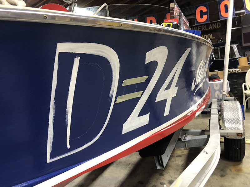
Well, yesterday I did it. I had built up enough courage to try and do some lettering on Stinky. I preached hand lettering and have been guilty of trying all sorts of other ways around to avoid trying it myself. Here where I live, a good hand lettering guy is getting harder to find. Capt Krunch retired so it leaves us with doing the dreaded decals. But I refuse to avoid it anymore and decided, what the hell, it’s just paint. Just paint over it. Like a Command Z..

I chose the numbers to be able to letter them. A 5 would have been torture.
I has bought a set of correct brushes and have the paint, so what the hell. I lit up the music machine and just dove in.

Playing with the right mixture of paint
I had printed out to size some type and placed it on for a reference. Some simple art school tricks and the outline was on.

Stopping to take photos leaving paint on the camera
The rest is a steady hand, which I do not have. And bam. What was cool was as I was painting, the real trick was to understand the anatomy of the type itself. To use the brush that way. Sounds kinda artsy fartsy, but thats what made the difference.

I need a bigger brush
I just have one coat on now, and will do another today. But dang! The flaws fit! And now Stinky’s history is alive. Now we just need a paper trail. After all, it’s just paint!

I love it. There is some research being done on the D or is it an E, Miss Miami is a D and now its on there, and after all I think the D looks cooler. And since all she is going to race is a sofa and dinning room table in the apartment this winter. Its great!
D
Here is a short Instagram film to get a better feeling. I turned off the blaring music. Italian Opera. Yah.. Great music to paint by. Its a flowing rythem you can tap into, but for gods sake everyone laughs at me.
View this post on Instagram

Nice work! You just need a rubber tipped baton to steady your hand. Now Stinky just needs a pin-up girl mascot, wait, that could go bad, don’t Google “Stinky pin-up girl”. Nevermind.
Ya.. Miss Stinky has the same issue.
What happened to the Y? Looks great otherwise.
Dang Les, you’re right, I went by the font, not what I had alterd on the transome. Will fix
Nice job, although the “y” looks a little like an”s” at first glance. Are you using one shot enamel signwriters’ paint? I used to live on a canal boat and did all the Roses and Castles and graining by hand, but using John Keeps or One Shot Enamel made the job enjoyable. White on blue was always going to be a two coater at least. And One Shot is American. John Keeps was English but closed down, so we only have the American import now which makes it VERY expensive.
The flaws do fit! Perfect imperfection. Hand made and Looks Great!
Going to fix the y, and I have a nice closet full of old One Shot cans. The older stuff is supposed to be better. I think. Sadly no white though so using a can of white Pettit thined a bit so it flows better, But no where as good as the One Shot.
one shot, ebay, $22.00 for 8 ounce.
I see you decided against the wake behind the name
Nice job Matt!
So cool. Well done, Matt.
Well done! Of course I can’t draw a straight line with a ruler.
So who is “uncle Lenny” now? Nice job!
Looks great! Although you are risking that the Boat History Gods will now reveal it’s true identity as #E-55 Miss Mildred !
NOOOOO! She is from Butts County?
Looks great!!!
Did you “pounce” the letters on first off the pattern?
How come is the spelling correct??
No Pouncing. Just a wax pencle . Second coat on and y fixed.
Stinky fixed.
Now you just need to get rid of that extra bottom weight and get Stinky up to speed …. 😉
Great Job. Looks like it has always been there. It looks like your paint is to dry and that’s what’s making the streaks that require a second coat. I have studied the sign and stripping guys and there are some old tricks. 1. Use “One Shot Paint” http://www.1shot.com/One-Shot/Home.aspx
It is made especially for lettering and stripes. Separate out the amount you expect to use into a smaller container and add a few drops of Turpentine. The Turpentine will make the paint flow and eliminate the streaks.
Very nice! Definitely looks right. Love it when something works out just the way you want it to.
Now for the starboard side…..
Wow thats very cool Matt. You have a great design eye.
I’m love the lettering , looks authentic. Props to you Matt for doing it yourself.