Mary-Ann And Ginger Bring The Heat – And Looking For A Good Nice B…
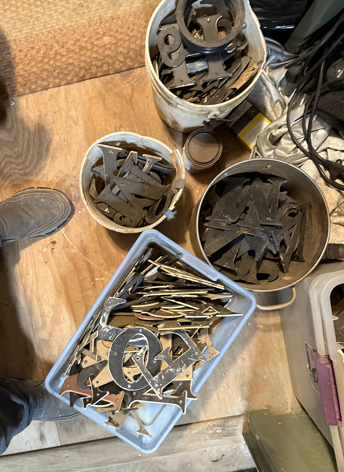
Buckets Of Letters
Yesterdays story was one of the most viewed stories in about a year. Was it Mary Ann or Ginger? Or did we hit a nerve? Russian Bots? It’s certainly not all the Which B talk. Well, yesterday I went into the parts room at HQ and dug through about 300 old letters, Plastic, metal, and so on, Dang, B’s are hard to find. And it all the searching I found a wonderful set I had stored away of some NOS decals. And maybe a new insight of including old TV hotties from our testosterone teens surge.
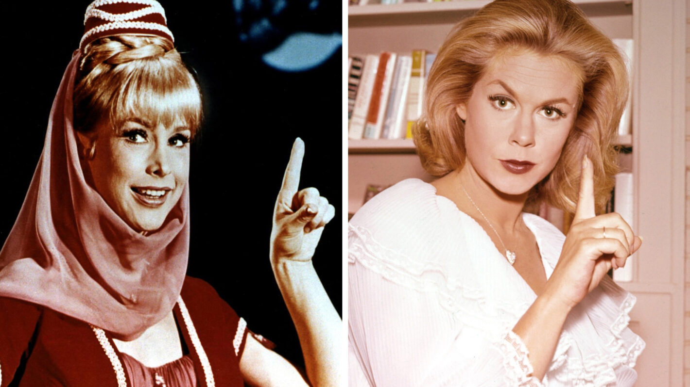
Jeanie or Sam?
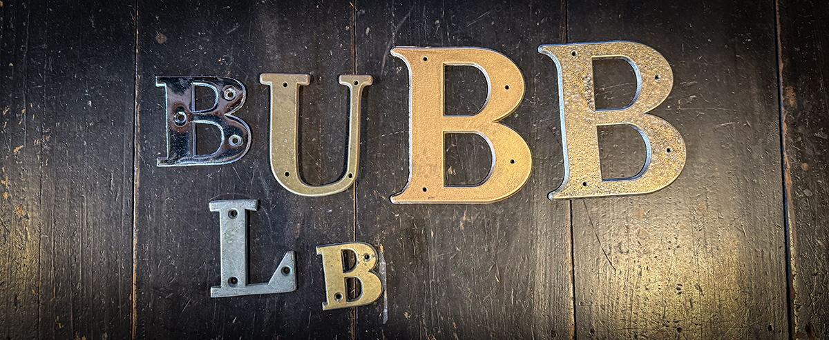
The chrome one is way to small, the larger ones, too plastic even if I painted them, So now I need to find the perfect metal B
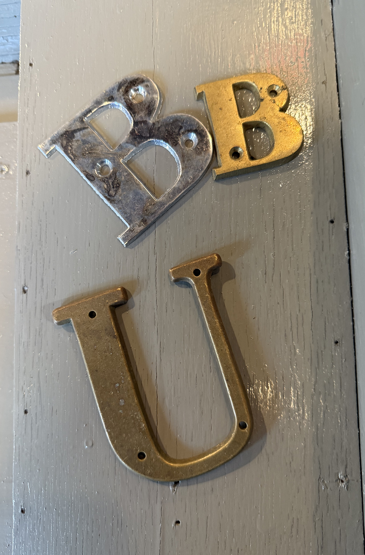
The chrome one is 3 inches, I have a little B that would be perfect if it was 4 inches like the U.
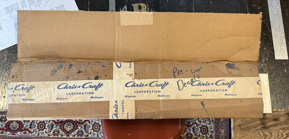
This is clearly from the late 40’s based on the tape logo
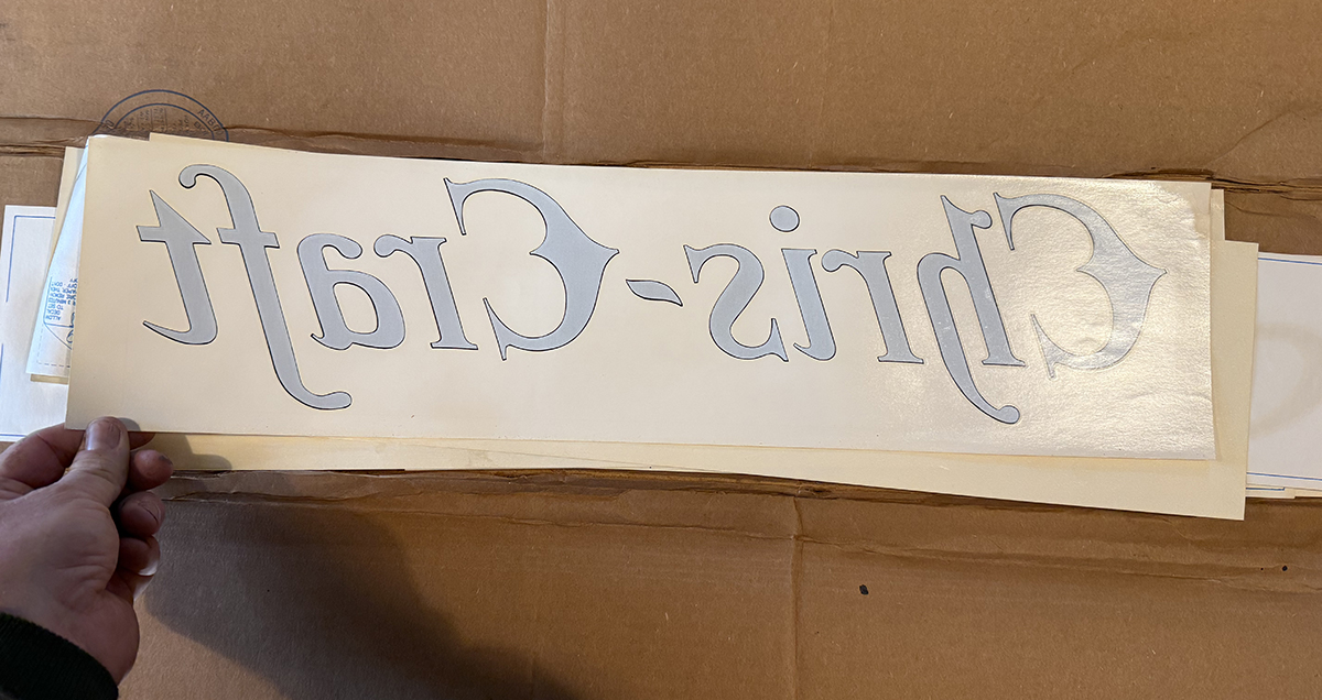
I have 2. But decals were not used, so I used this as a measurement.
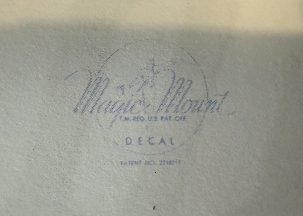
Decal trademark
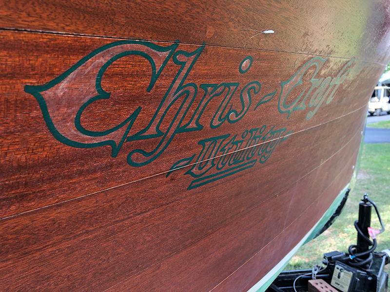
NOW, if a metal B can not be located. I willl have to resort to a either factory look? OR what an owner might have had done at the Marina. I could go deep inot the weeds of George Mercer boats from the Clayton dealer and see what else they may have lettered back in the day. DEAR GOD! DORA is not soon enough.
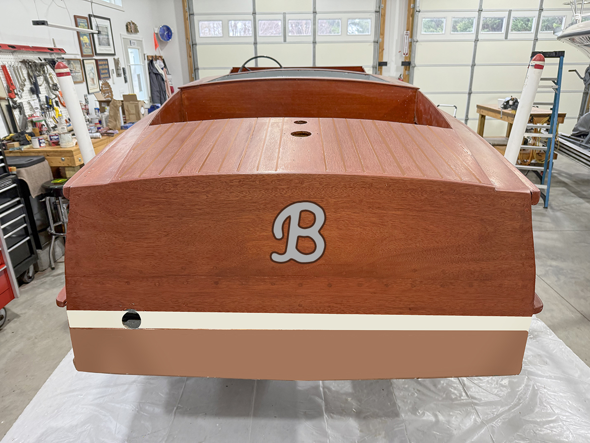
Maybe the homemade painted on look
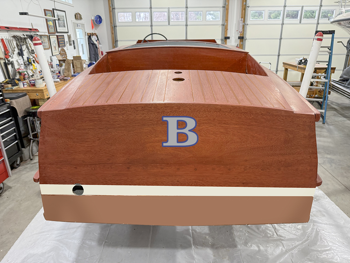
Useing the Metal letter font as a look, Bodoni, Century Old School are classic fonts from back then
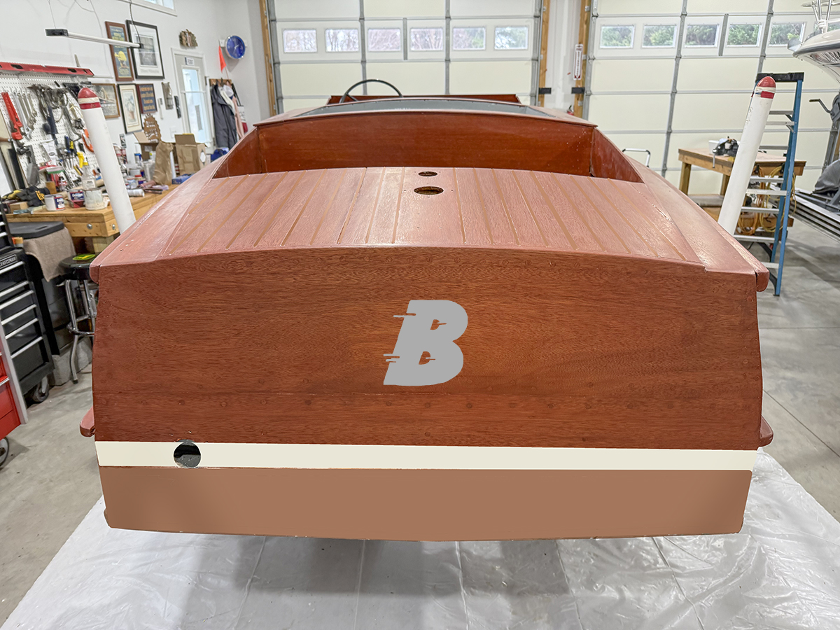
The in motion look, like SNAIL
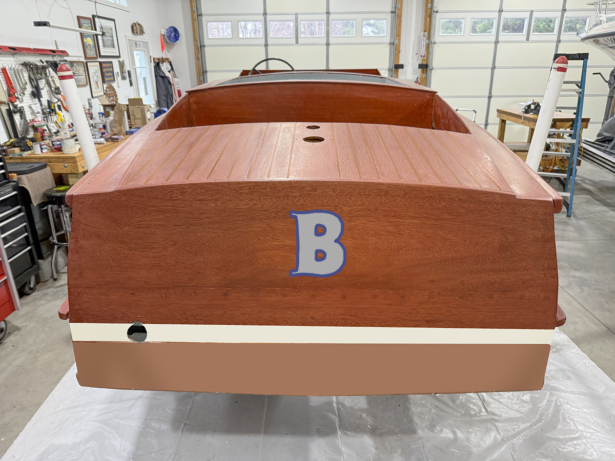
These are vintage poster fonts

A hybrid CC font look
Now if you will excuse me I am going to go crawl into the fetal position in the corner with Mike Green
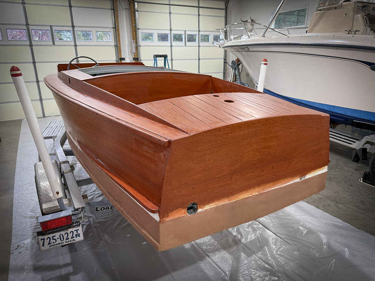
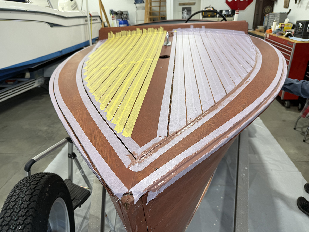
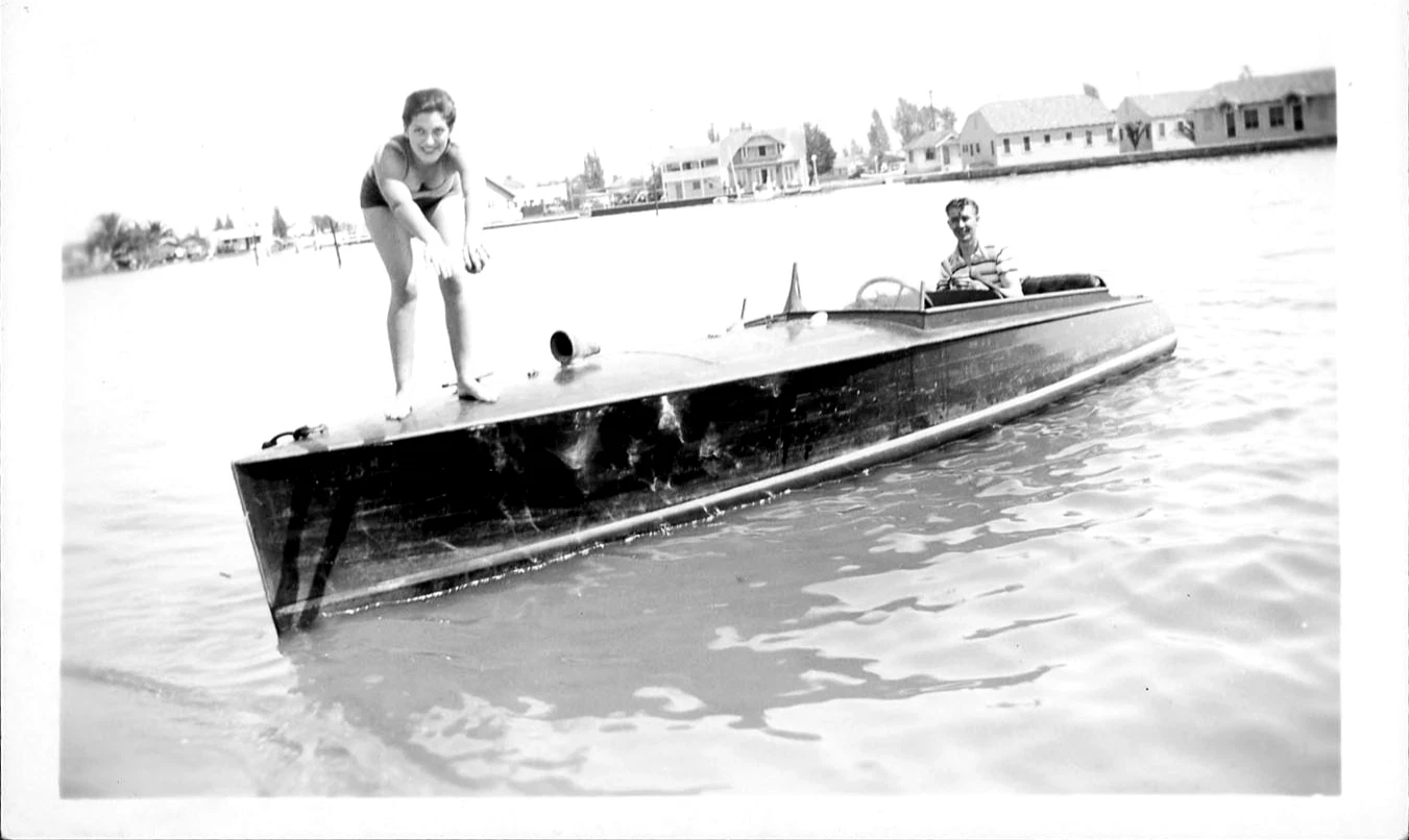
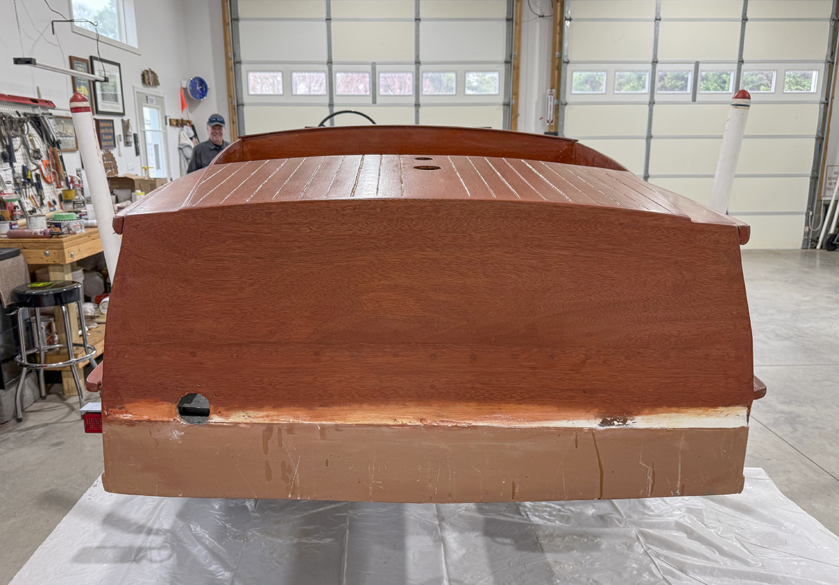

Yup, YORKTOWN has those plastic letters, but being a 1957 21′ Utility it fits perfectly.
I do like the 3D aspect of the metal B.
How do you do maintenance varnishing around all those raised plastic letters? Just varnish over them? I am working on a boat that has them and I’ve debated about keeping them or not.
And regarding Sam and Jeannie; both looked magically delicious.
Simply remove them, varnish the transom, paint the letters on a piece of cardboard, and reinstall.
The beauty of these type of letters is they are removeable. small screws. Thats why they were so popular as numbers and so on. You could buy them out of catalogs. The trick for me is the font and so on. The plastic ones FEEL like 60’s- where as some of the old metal ones, like the bronze U in the pics is perfect. Slightly flawed. Like me!
Why no B’s in the bucket…check your old school address and phone book…more B’s that anything…
Great stuff lying around in the railway bins! As to style…I have no dog in that fight! John in Va
Brass but only 3 inches tall. If you had an R it could be Mr. B.
Yours if you want them.
This all I can add
https://www.google.com/search?q=b+wife+joke%C2%A0&client=safari&hs=nh8o&sca_esv=86a8767359d2db52&channel=iphone_bm&source=hp&ei=bWhiaeBqx9zA3g-2oe-RDQ&oq=b+wife+joke%C2%A0&gs_lp=EhFtb2JpbGUtZ3dzLXdpei1ocCINYiB3aWZlIGpva2XCoDIFECEYoAEyBRAhGKABMgUQIRigATIGEAAYFhgeMgYQABgWGB4yCxAAGIAEGIYDGIoFMgsQABiABBiGAxiKBTIFECEYnwVIi0dQswpYmzVwA3gAkAEAmAF6oAGaCaoBAzYuNrgBA8gBAPgBAZgCD6ACqAqoAh7CAgsQKRiABBixAxiDAcICDxApGIAEGLEDGIMBGAoYC8ICCBApGIAEGLEDwgICECnCAgUQKRigAcICEBAAGAMYtAIY6gIYjwHYAQHCAhAQLhgDGLQCGOoCGI8B2AEBwgIFECkYgATCAggQLhiABBixA8ICBRAAGIAEwgIOEC4YgAQYsQMY0QMYxwHCAgUQLhiABMICDhAuGIAEGLEDGIMBGIoFwgIOEC4YgAQYxwEYjgUYrwHCAhEQLhiABBixAxjRAxiDARjHAcICCxAuGIAEGLEDGIMBwgILEAAYgAQYsQMYgwHCAggQABiABBixA8ICDhAAGIAEGLEDGIMBGIoFwgILEC4YgAQYxwEYrwHCAggQABgWGAoYHpgDFPEFCeZLzRFbWfC6BgQIARgKkgcENS4xMKAH-VKyBwQyLjEwuAeJCsIHBjItMTQuMcgHVIAIAA&sclient=mobile-gws-wiz-hp#fpstate=ive&vld=cid:daba307a,vid:-xQfLGMstRM,st:0
Thanks woodyboater
I vote for a simple B in a period correct typeface. Metal is great. the emphasis should be on the boat and an elaborate name diverts attention to it. Less is more, Matt, to borrow the phrase.
Hell, you can keep Mary Ann and Ginger. I’m only $1,999,992.88 short of owning the prettiest damn thing on the water.
Etsy. You can find people who will make them in metal for you. You just might have to have them chromed/finished. Unless you paint them.
Here are a few “B” from my secret font collection if you’d like? If you want anything machined and contoured out of stainless (polished) or bronze (nickel or chrome plated) let me know. Or a low-tack vinyl template is always easy to make for hand lettering.
Fitzke beats Etsy by a country mile.
HA! I have some of those secret fonts as well. I will emaill you Kevin, thanks
And like Old Salt suggested, whack it with a hammer to honor its history
As a party of one, I still think it should be lower case because this is the smallest cockpit boat they built.
I dont disagree, if one can “b” found.
When growing up, always wanted to B Samantha Stevens.
When I could not find reproduction hardware for my boat I created models from wood based off original boats then sand-cast them.
24kt gold plated and screws.