Making Airt From Pictures, Oh Come On It’s Kinda Cool
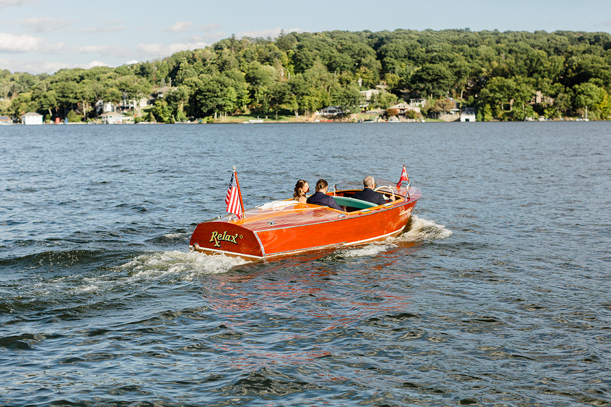
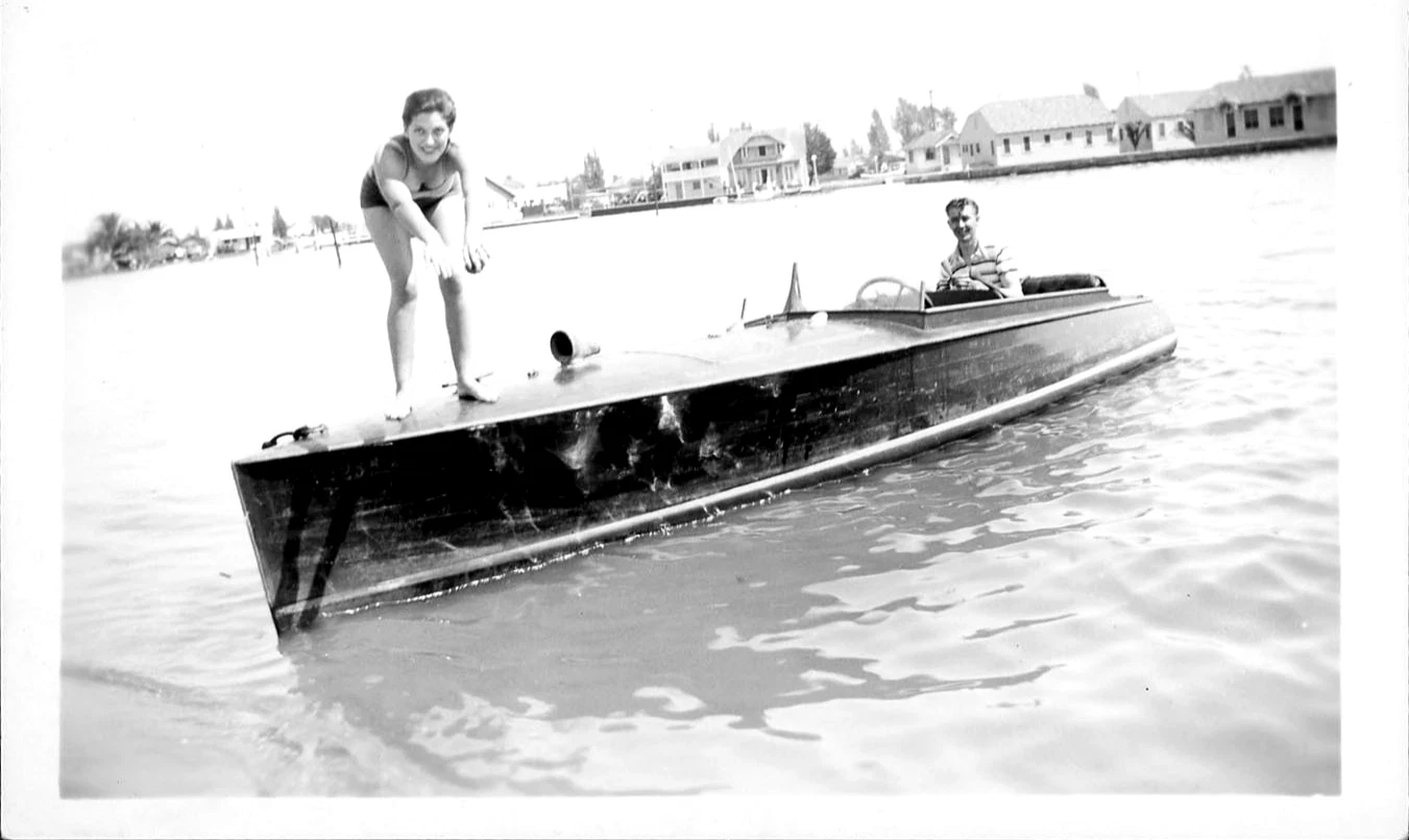
This is the original image that Bob sent – a simple image yet no real mood
Yesterday we featured the wedding shots from Bob Kays. And of course I had to invite Zip into the party, and then got caught up in the AI thing and thought. Mmmm self, what would this image look like as a painting? Not just any painting, but Winslow Homer? Or Matise? Impressionistic? Cubist? What is the right style for this image and does it change the emotion of it? And dang a funny thing happened. A deeper thought about how this all happens. BTW, consider this sort of thing for your next poster for your show. They are all looking the same now!
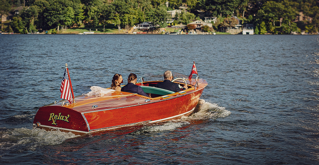
I cropped it and made it a tad more saturated. No AI, but did manipulate the color and added a bit of sunshine on the right as a destination. Was perfect for the story it told
Where the talent comes in, the human part is in how the scene is conveyed, and how the artist has a unique point of view or style. Thats the art of it all. There is the idea, then the execution. SO? What you see here is the next level of execution, not innovation, or style. In fact these styles are already kinda self explanatory. And in there is the fun of all this. Exploring the feeling of the image.
A kinda choppiness to it. Communicates a rough wedding? And Relax feels like an ironic command. Same image
First off, lets get this out of the way. Painters have long used real life as a thing, people posing, landscapes. Then Photography came into the …wait for it… the picture. Replacing paintings? No, in fact painters used photos as reference, everyone did, In fact painters used mirrors back before photos to trace stuff on a canvas.
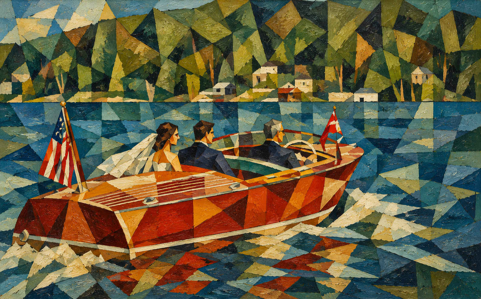
Another cubist inspired look, communicates a bit of options. Would work greta with a headline about the many things to consider when using a boat for your wedding
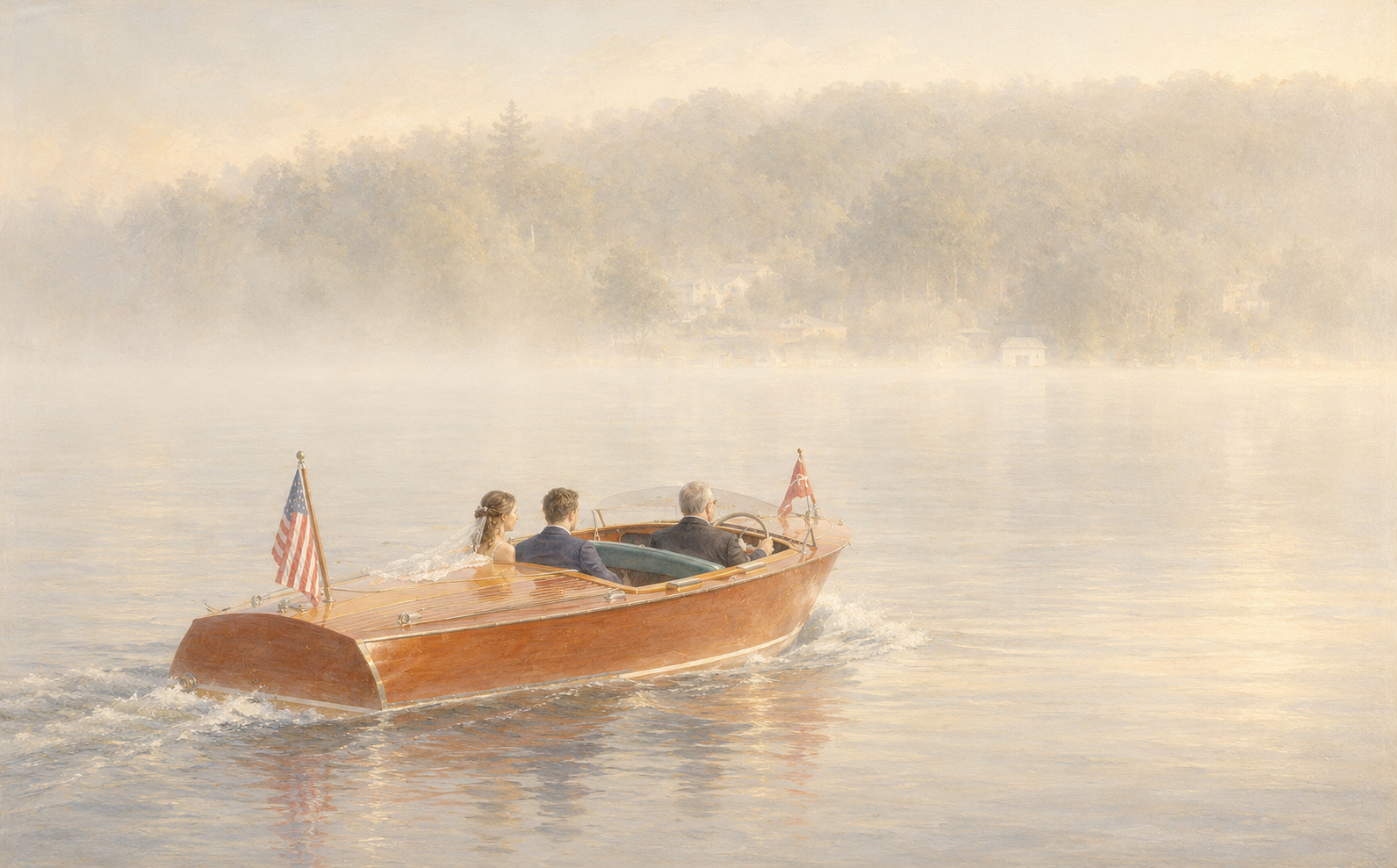
A very simple airy calmness. Early morning mood
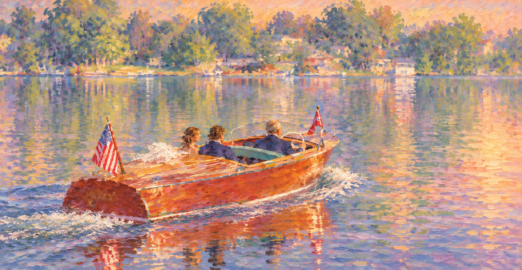
Extreme impressionistic style to give it a very soft colorful feel
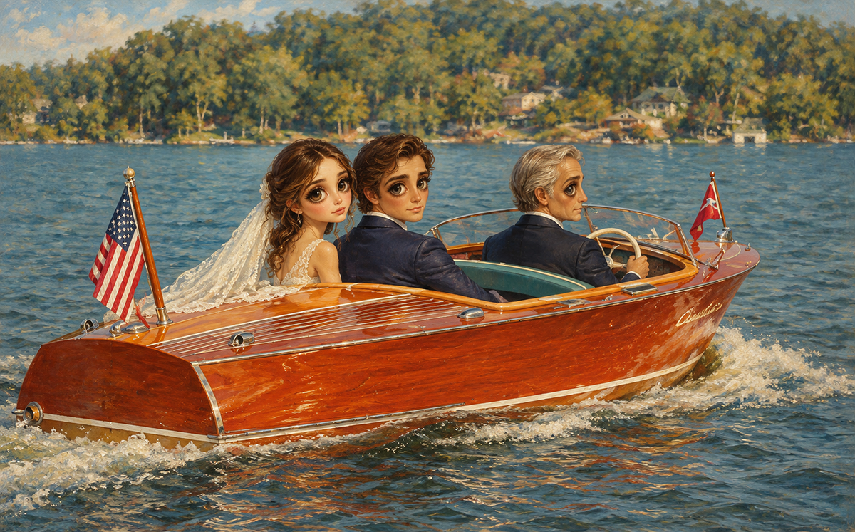
Oh those Big Eyes they need your help
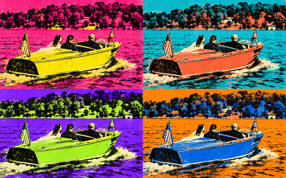
A Pop art look
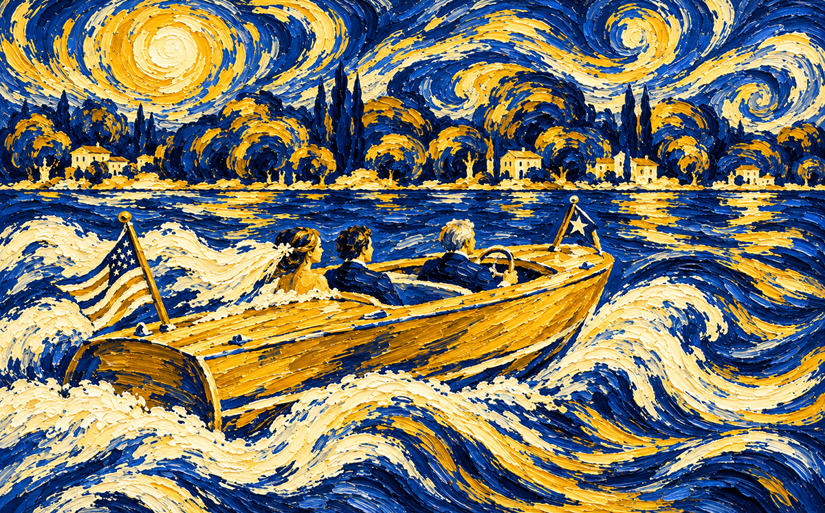
This one cost me an ear! sort of chaos in it
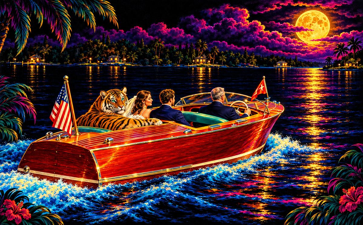
Black velvet truck stop look
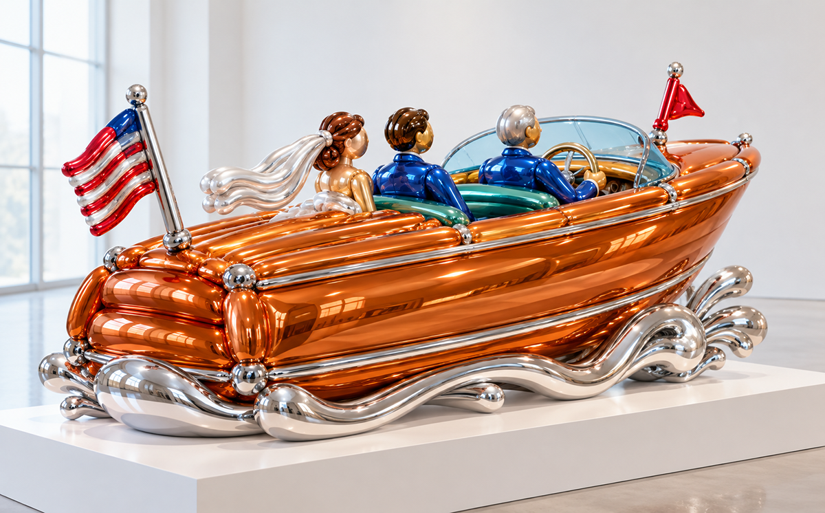
A cool, pop culture sculpture
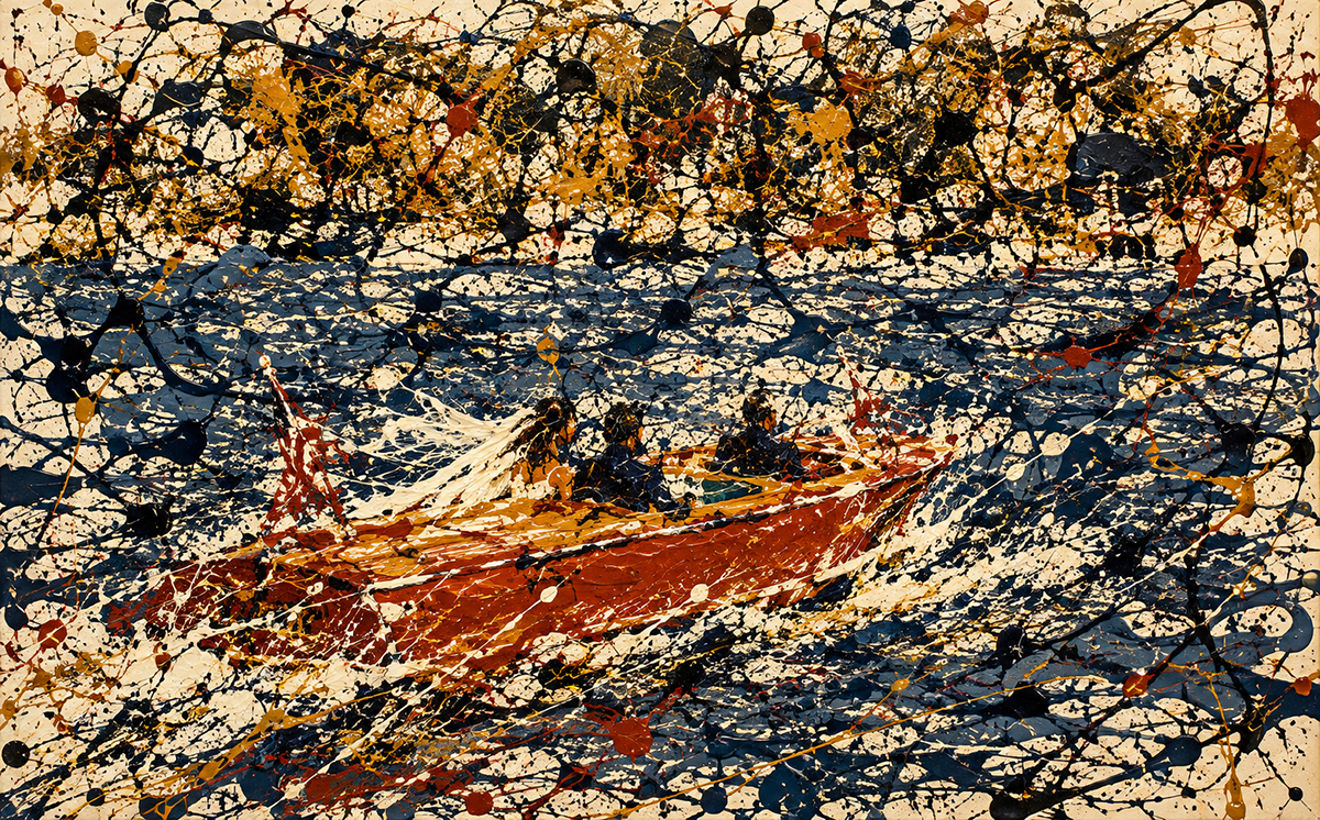
Much more modern art
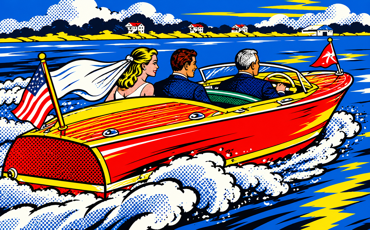
More pop art style
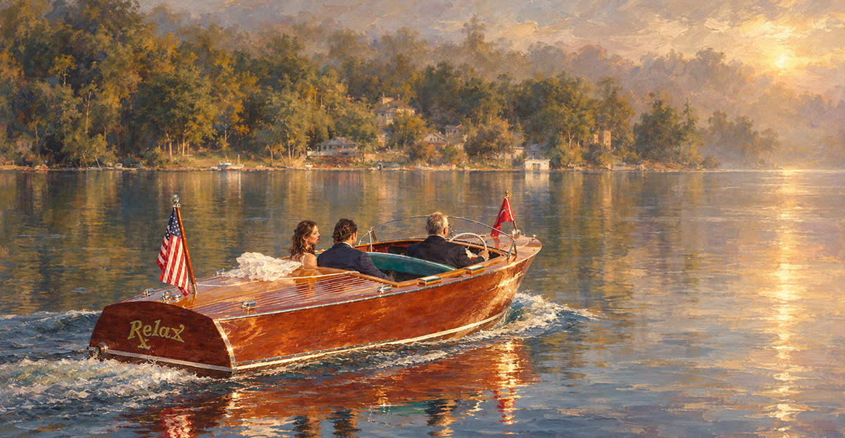
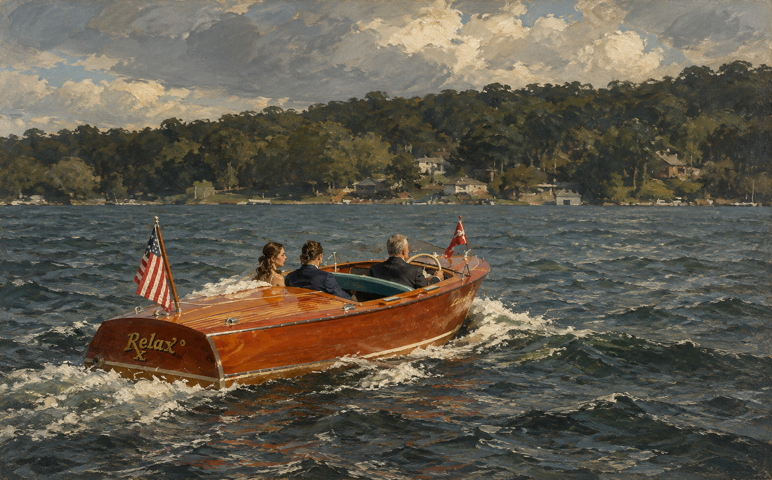
Getting in the period style of the Impressionistic period, again, making the name on the boat and mood match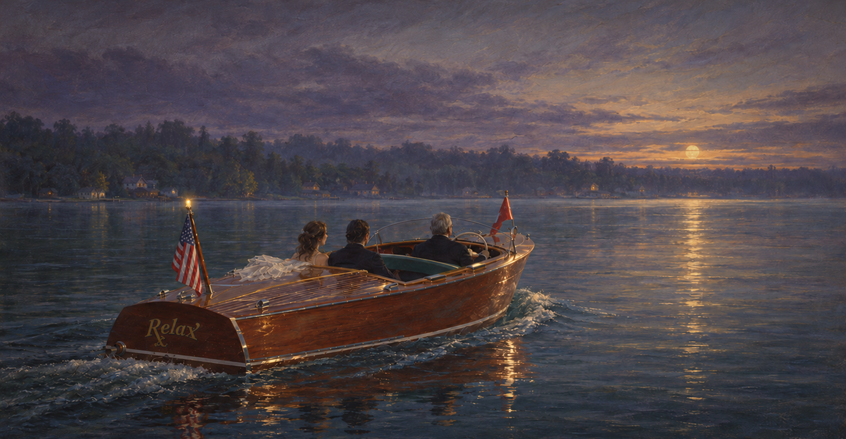 And here it feels like an evening ride. Maybe the trip home after the event. This is how color and style can effect the mood and meaning. Same exact image
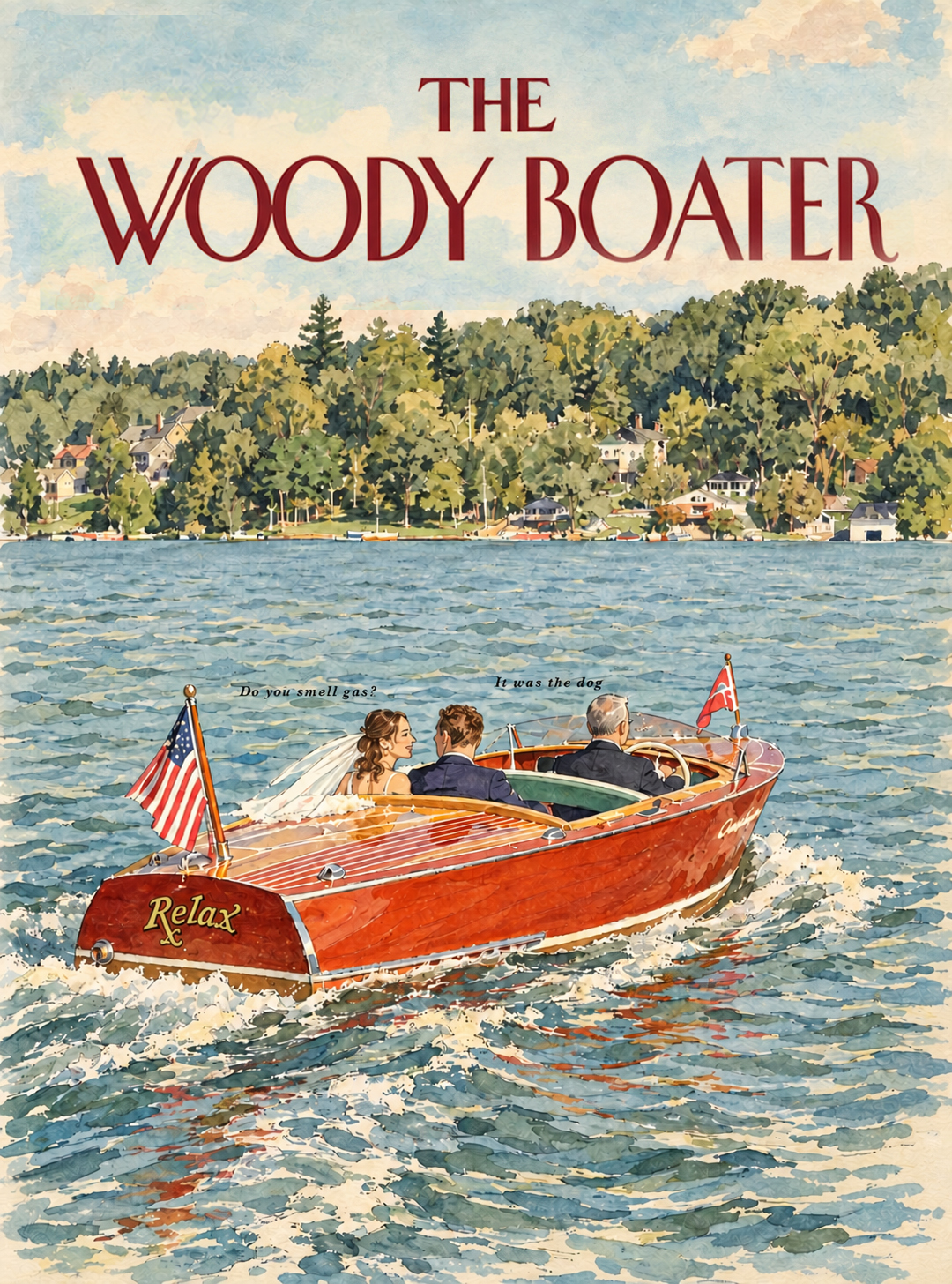
Sometimes the context of where the art fits encourages a tone
And todays header for your enjoyment. ART IS BACK for this pARTy! He changed his name to AiRT! Yikes lots of puns in that one line. UGH
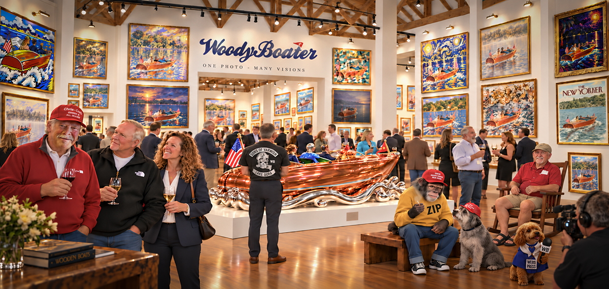
A spontanious art show. I don’t think Zip is a good influence on Mr B.

Well that was fun!
Our boating buddy looks pretty good!
Just when you thought it was safe to go back into the water…🤣
I have been dabbling in this as well. Colored pencil sketch of Bob Shapton’s.
Its crazy, love Bobs boat, I love how some simple adjustments can effect the feeling of it. This is how we would choose a specific artist to take the photo or do an illustration. A couple things, the human part of this is always far better, fresh, spontaneous and trustworthy. We use AI at work to present the idea, the rough vision. Not the final. And ALWAYS! The artist version blows away the AI comp. But man oh man, it is amazing to see how it can effect the idea. Also there are clear copyright issues. And I am passionate about that. The laws are being rewritten to adapt. Crazyness, again. At our age we have seen a lot of change in all this kinda stuff. I can still recall watching a spool of fax paper come out of a machine and thinking. WHAT THE HELL..
I should be OK in this case since Bob sent me the photo.
Living at tahoe in the ’80s; driving down the hill to SFO seeing full-size billboards proclaiming “FAX IS HERE”…..ahhhh, those were the days…..
And pencil sketches seem to bring out the details. Boats On The Boardwalk Show in Traverse City a few years ago.
Dang!
That is amazing work!!!!!
I would have thought that Bob’s boat was a photo.
Oh…the mind of Matt! Like it’s been said before, I can’t wait until that Christmas party!
Brock these are great – I hope all the ACBS clubs read this today, and rethink the boat show posters. They all look the same and kinda lame. Which is why a designer should do stuff like that.
Brock’s pencil sketch would make an awesome show poster!
A poster from my earlier days old WoodyBoating.
Speaking of posters and Ai, for our recent PNW boat, this poster was created. Look closely, I don’t know for sure, but I bet someone at the printer created it, or maybe someone trying to learn how to use Ai. Thanks Matt, you are an artist in your own right.